🐆 🐆 🐆. (That’s a ritual tiger-tiger-tiger for the last day of the month; details below.) Today is Ultimate June, the final day of a month packed with occasions of considerable emotional content, also (etymologically) a month dedicated to the Roman goddess Juno: queen of the gods (in fact, also called in Latin Regina ‘queen’), counterpart to Greek Hera; protector of women and motherhood; also embracing warlike features of Greek Athena, the goddess of wisdom and war (the deities of classic times were marvels of intersectionality, as we would now put it), and oh yes, wife of Jupiter, the counterpart to Greek Zeus.
So I am suggesting that 6/30 be recognized as Ultimate Queen Day, especially celebrating men who are flamboyant (in any way) and those who are effeminate (in their presentation of themselves). Stereotypically, these two bundles of characteristics are manifested together, in the cultural type the queen (not to be confused with royalty, with the drag queen, with X queen used to label tastes or preferences of many kinds — imagine a white-cross queen, a man who prefers Swiss men as sexual partners, or a fan of Swiss things — or with various other uses of /kwin/).
To come: on the content of the month of June; a bit more of etymology; on flamboyance; on some queens; and, yes, on 🐆 🐆 🐆.
The month of June. Relevant for everyone: June has the Summer Solstice in it, and Midsummer Day quite close to that. The Summer Solstice Day is often labeled “the first day of summer” (in the Northern Hemisphere), but no ordinary person talks that way; folk (and commercial) usage treats the season of summer as embracing June, July, and August, with exact starting and ending dates a matter of local custom. There are ways of thinking about summer, but June is, first of all, a summer month — time for exposing the body, in minimal (or no) clothing; playing in the water (in swimming pools or, especially, at the beach ); randy sex (all over the place, by day or by night); and, in the US, baseball.
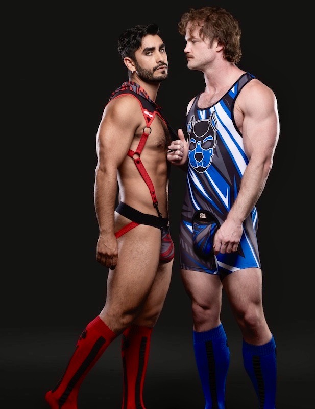
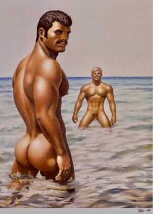
I must confess that I have a 🐇 🐇 🐇 posting for 6/1 that looks at this summer-month stuff, still not finished and polished after about 30 hours of work; I am overwhelmed by life. As a place holder, vividly illustrating June As Summer, the image (Hot Water) on the June page in the Tom of Finland 2022 calendar:
 (#1)
(#1)
Then, relevant to various parts of my life:
— June is Gay Pride Month
— and has Juneteenth in it, a US holiday celebrating the end of slavery in my country
— and has Flag Day in it, a US patriotic occasion, memorializing the adoption of the US flag in 1777
— and has the commercial holiday Father’s Day in it, which functions as a gender event, celebrating conventional masculinity in all its forms — in particular, it’s a Masculine Meat Holiday (see my 6/17/22 posting “Be the Master of the Meat!”) — and also as a sexuality event, through being hi-jacked by gay porn studios as a vehicle for Daddy – Boy sex films.
A little more etymology. If I read the OED right, the month of June (in English) gets its name from the month name in Classical Latin, the masculine noun Jūnius, which is the masculine version of the feminine name Jūnō — the goddess Juno.
Flamboyance. Queens are flamboyant, etymologically ‘flaming’. Then from NOAD:
adj. flamboyant: 1 [a] (of a person or their behavior) tending to attract attention because of their exuberance, confidence, and stylishness: a flamboyant display of aerobatics | she is outgoing and flamboyant, continuously talking and joking. [b] (especially of clothing) noticeable because brightly colored, highly patterned, or unusual in style. …
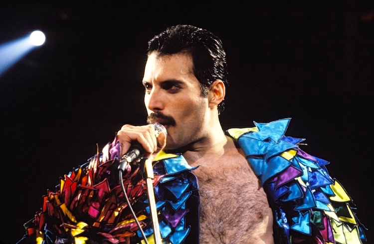
On flamboyance in action, consider, among others: flamboyant entrepreneurs (Malcolm Forbes, Richard Branson, Jack Ma) and flamboyant musicians (Jimi Hendrix, Mick Jagger, Steven Tyler). Here’s Freddie Mercury (of Queen), queening flamboyantly in performance:

(#2) Note armband on the right arm, indicating a sexual receptive or subordinate
On flamboyance in dress, consider, among others: historical dandies, peacocking by men, extravagant fashion models, and the costumes of some flamboyant musicians. Here’s Freddie Mercury again:
 (#3)
(#3)
Meanwhile, I’ve posted often about flamboyant items of apparel: underwear and gymwear in fabulous colors and patterns, loungewear, and shirts of all kinds. I bought my first gorgeously patterned shirts at the B. Altman flagship store on 5th Avenue in NYC in 1958; I was 17, and you can see, from the fact that I remember so many details, that it was a moving experience. Many others followed.
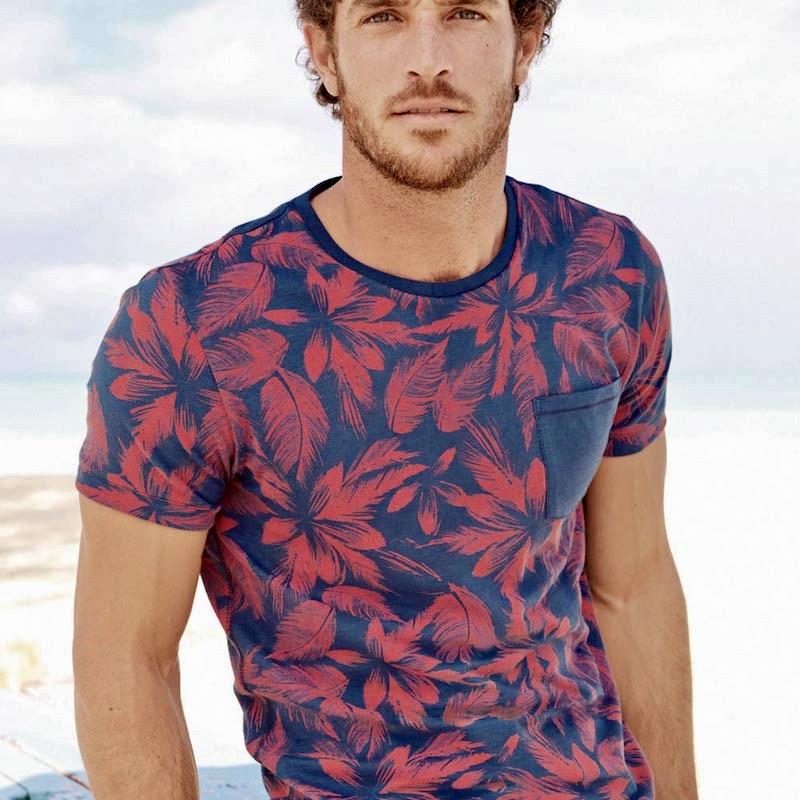
Now I collect images of such things, rather than the things themselves, and I tend to specialize in floral patterns (well, I’m a plant person as well as a queer person). From the GentleManual site, “Floral Style: A Masculine Guide to Fresh Floral Prints” from 8/1/19, this attractively flamboyant floral t-shirt, worn by a model who’s also to my taste (though not flamboyantly posed):
 (#4)
(#4)
Finally, flamboyance in personality. First, a little study in Going Too Far. From the MentalHelp site on “DSM-5: The Ten Personality Disorders: Cluster B”:
the dramatic, emotional, and erratic cluster. It includes: Borderline Personality Disorder; Narcissistic Personality Disorder; Histrionic Personality Disorder; and Antisocial Personality Disorder. Disorders in this cluster share problems with impulse control and emotional regulation.
… Persons with Histrionic Personality Disorder are characterized by a pattern of excessive emotionality and attention seeking. Their lives are full of drama (so-called “drama queens”). They are uncomfortable in situations where they are not the center of attention.
People with this disorder are often quite flirtatious or seductive, and like to dress in a manner that draws attention to them. They can be flamboyant and theatrical, exhibiting an exaggerated degree of emotional expression. Yet simultaneously, their emotional expression is vague, shallow, and lacking in detail. This gives them the appearance of being disingenuous and insincere. Moreover, the drama and exaggerated emotional expression often embarrasses friends and acquaintances as they may embrace even casual acquaintances with excessive ardor, or may sob uncontrollably over some minor sentimentality.
People with Histrionic Personality Disorder can appear flighty and fickle. Their behavioral style often gets in the way of truly intimate relationships, but it is also the case that they are uncomfortable being alone.
They tend to feel depressed when they are not the center of attention. When they are in relationships, they often imagine relationships to be more intimate in nature than they actually are.
People with Histrionic Personality Disorder tend to be suggestible; that is, they are easily influenced by other people’s suggestions and opinions. A literary character that exemplifies the Histrionic Personality Disorder is the character of Blanche DuBois in Tennessee William’s classic play, “Streetcar Named Desire.”
That’s the bad news. The world is, however, well supplied with delightful flamboyant queens, extravagant but empathetic, fully in control of their emotions while presenting an exaggerated version of themselves. There are, in fact, several subtypes. From my 5/29/22 posting “The pansies and the birds will speak for us”, with Paul Harfleet, author of Pansy Boy, displaying his Tough Queen face:
(#5) This along with illustrations of a tough queen — Emory in the 1970 movie of The Boys in the Band — and a ditzy queen — Randy Rainbow giving his musical commentaries on the news
Both characters [Emory and Randy] are dead serious, with moral agendas behind the apparent superficiality of the personas they project (of eye-rolling, disdainful self-involvement for Emory; of wide-eyed, scatter-brained silliness for Randy). This they share with Harfleet, whose ornamental, often sexualized presentations of himself can’t conceal the almost painful urgency of his aim to rescue the children, honor the despised, and celebrate nature’s gifts of flowers and birds.
There’s more. For several years, my department chair at Ohio State was a good friend who presented himself as what I now think of as an ornamental queen: full of amiable laughter, warm companionship, and energy, with the gay gestures, the gay voice, all the gay eye stuff (side-eyes, wide eyes, eye rolls), all of that dialed up to about 150% of normal. He had a fine conventional three-piece suit that he wore when one of his students defended their PhD dissertation (the suit was a mark of respect for them), but mostly dressed flamboyantly. He went to Humanities College Executive Committee meetings (with the deans and the other department chairs) in very worn denim short shorts that showed off his gym-developed lower body, plus an equally worn Mickey Mouse t-shirt that showed off his upper body. Vibrating energy and enthusiasm.
And it all worked. Well, he was an able administrator, a solid scholar (in Indo-European historical linguistics!), a wonderful teacher, and a tireless, thoughtful adviser. And yes, a treat to look at and a hell of a lot of fun to be around.
The jaguar-jaguar-jaguar goodbye. The counterpart to the rabbit-rabbit-rabbit hello. For which, see these two postings:
— from 5/1/17 in “Rabbit, rabbit, rabbit: three cartoons for the 1st”, on the ritual
that calls for everyone to greet the new month, upon awakening, by saying “rabbit, rabbit, rabbit”
— from 5/1/20 in “Trois lapins pour le premier mai”
So the question became: what’s the opposite of a rabbit? The closest animal opposition to rabbit is hare, but that’s way too narrow. What we want is something opposed to rabbits in a number of relevant features.
Rabbits are small, furry, large-eared mammals; they are gregarious, gentle, fast-moving, shyly reclusive, prolifically breeding, herbivorous prey animals. They are folklorically cunning (in trickster figures) and hypersexual (so serving as symbols of fertility and rebirth, and then of spring and Easter).
So, sticking to the world of mammals, we’re looking for a large fierce carnivorous predator (forget about the fur, which most mammals have, and the ears, since most mammals have smaller ones; and the big broods, since large predators in general have small broods). Jaguars were my first choice, because they’re viciously fierce and much fleeter of foot than even the fastest rabbit (even the Energizer Bunny), and because I just love the name jaguar. Alas, Apple has no jaguar emoji, or even a panther; so I settled for the tiger emoji. Tiger tiger tiger, goodbye, month.