The Wayno/Piraro Bizarro collabo from the 9th:
(#1) If you’re puzzled by the odd symbols in the cartoon — Dan Piraro says there are 2 in this strip — see this Page. Meanwhile, the pie segments run through the flavors in the order named, clockwise from the pumpkin segment at the top.

Transpositional wordplay of an especially simple sort, involving a two-word expression, with X Y ~ Y X — in this case taking off from a conventional N + N compound, the metaphorical pie chart ‘chart resembling a pie’, and reversing the parts to yield the novel, and entertaining, (also metaphorical) compound chart pie ‘pie resembling a chart’.
The model expression pie chart refers to an object familiar in our culture, while the play expression chart pie refers to something novel and surprising: a pie made up of segments drawn from various different pies. Not a combination or mixed pie, like the familiar strawberry rhurbarb pie — a kind of hybrid pie — but instead a composite (‘made up of various parts or elements’ (NOAD) or chimerical pie, with distinct parts taken from different pies. (On chimeras, see my 11/13 posting “The chimera of Faneuil Hall”.)
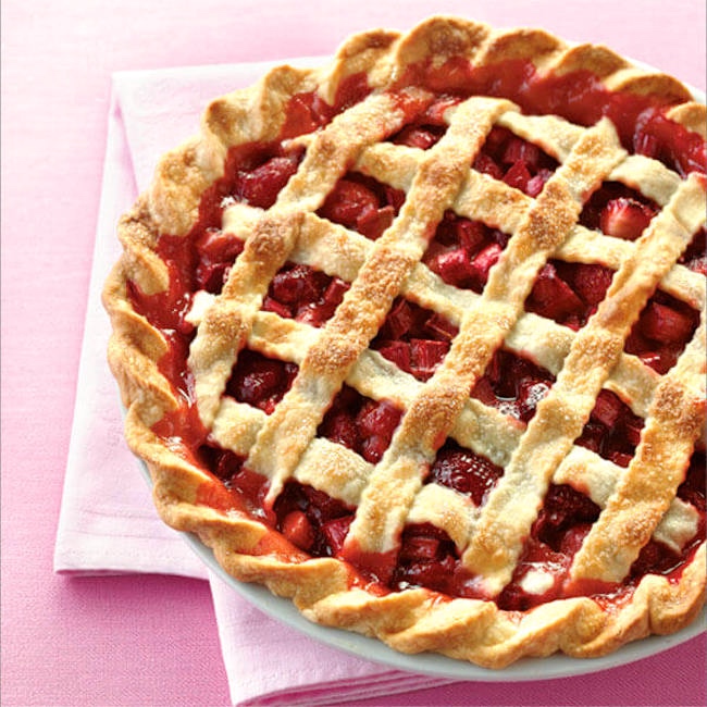
Mixtures vs. composites. The chart pie in #1 is a composite or chimera, a rarity in the pie world, where, however, mixtures or hybrids are common. So, there’s strawberry pie, and there’s rhubarb pie, and (in part because rhubarb is very tart and requires lots of counteracting sweetness) there’s strawberry rhubarb (or strawberry-rhubarb) pie, with the two principal ingredients mixed together for balance; from Wikipedia:
(#2) Strawberry rhubarb pie (from the Land O’Lakes site)Rhubarb pie is a pie with a rhubarb filling. Popular in the UK, where rhubarb has been cultivated since the 1600s, and the leaf stalks eaten since the 1700s. Besides diced rhubarb, it almost always contains a large amount of sugar to balance the intense tartness of the plant. A strawberry rhubarb pie is a type of tart and sweet pie made with a strawberry and rhubarb filling.
Mixed-race people are, of course, quite common, but composite-race people are the stuff of (often off-color) joke and fantasy.
On the joke side, there’s the tale of an army sergeant who’s white but admits that he has black privates, which makes him a decidedly “sporty fellow” (in the version of the joke I first heard, some 60 years ago). And on the fantasy side, there’s Strephon in Gilbert & Sullivan’s Iolanthe, who (with a fairy mother and a mortal father) is a fairy down to the waist, but his legs are mortal — thus giving rise to the burning question (not one that G&S ask) of the nature of his intervening genitals: Strephon’s Package — Powerfully Fairy or Merely Mortal?
Pie charts. From Wikipedia:
A pie chart (or a circle chart) is a circular statistical graphic, which is divided into slices [that is, circular segments, segments of a circle] to illustrate numerical proportion. In a pie chart, the arc length of each slice (and consequently its central angle and area), is proportional to the quantity it represents. While it is named for its resemblance to a pie which has been sliced, there are variations on the way it can be presented. The earliest known pie chart is generally credited to William Playfair’s Statistical Breviary of 1801.
Pie charts are very widely used in the business world and the mass media. However, they have been criticized, and many experts recommend avoiding them, pointing out that research has shown it is difficult to compare different sections of a given pie chart, or to compare data across different pie charts.
Pie charts are especially troublesome when there are more than a few data points or when the values are fairly close to one another — the problems being that pie charts don’t provide side-by-side comparisons and that arc lengths (or segment areas) are harder for people to judge and compare than line lengths (or bar areas).
Considered as a pie chart, the chart pie in #1, with five constituent pies, conveys clearly that pumpkin is the predominant pie, but the comparative status of the other pies is hard to judge by eye (even when you’re told that they come in descending order going clockwise).
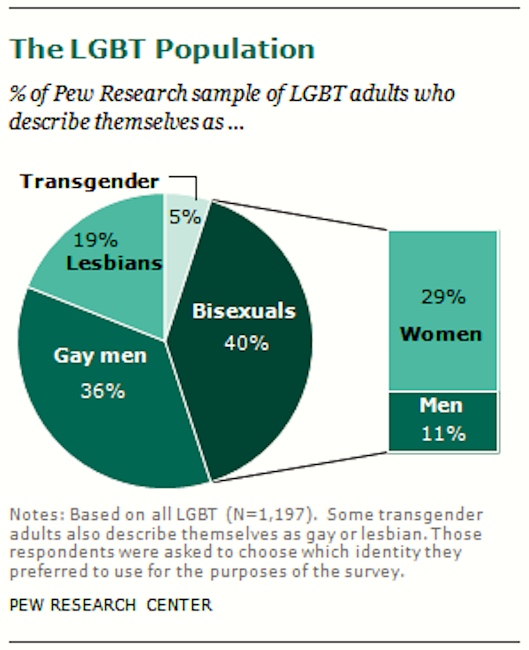
A somewhat more successful pie chart, again conveying information about five categories, but illustrating other complexities in the display of complex information. From the Pew Research Center site “A Survey of LGBT Americans” on 6/13/13, this summary:
(#3) Five categories in all: trans vs. cis; then within cis, four categories, homosexual vs. bisexual crossed with female vs. male — but treating all bisexuals together in the pie chart, pulling out the subanalysis of bisexuals in a separate bar chart
(Set aside all those issues about how the data were obtained, how the categorizations were made, and so on. Assume for the purposes of pie chart discussion that the chart is a picture of reality.)
This display shows clearly the great disparity, within the homosexual category, between women and men, with men predominating by a large margin. And it shows the size of the bisexual category; even without the percentages, you can see that’s it about the same as the gay male.
Meanwhile, in the side bar chart, you can see the great disparity, within the bisexual category, between women and men, with women predominating by a large margin.
What the chart conceals is the virtual parity beween the sexes overall in the cis category: the women are 48% in total (19% of the sample are lesbians, 29% bisexual women), the men 47% (36% of the sample are gay men, 11% bisexual men).
One lesson here is that pie charts aren’t much good at giving the whole picture when you have cross-cutting categories, though they can highlight some salient features of the data.
Word transposition: reversal / exchange / metathesis / spoonerism. A type of speech error. A joke form. And (under the name chiasmus) a rhetorical figure.
Speech errors. From my 2/5/16 posting “Word exchange/reversal or what?”, about
what’s known in the speech errors business as a word reversal (Vicky Fromkin’s preferred term), word exchange (my preferred term), word metathesis, or (more colorfully) word-level spoonerism
In most of the examples in Fromkin’s collection and mine, the transposed words are not adjacent, but are accented items in larger constructions, as in these two from Fromkin:
P13 a tank of gas → a gas of tank
P17 used the key to open the door → used the door to open the key
But there is this N + N compound example:
P16 gold mine → mine gold
The result isn’t notably funny, of course.
In principle, thanks to the unconstrained range of interpretations available to N + N compounds — never forget the lesson of canoe wife and its kind — any such compound is reversible, but the results rarely lend themselves to successful language play, even with ingenuity. And most easily reversible compounds are just pedestrian, in either order:
cave man / man cave, orange juice / juice orange, dog house / house dog, party boy / boy party, ring finger / finger ring, …
So chart pie from pie chart was a stroke of cleverness.
Deliberate wordplay. Word reversals / exchanges are more widely the basis for wordplay, as in my 6/1/18 posting “A chiastic bird”, with this Bizarro:
(#4) Chiastic (transpositional, Spooneristic) wordplay on the title To Kill a Mockingbird

— chiastic, from the shape of the Greek letter ch, which can serve as a diagram of exchange:
(#5)

The rhetorical figure. And then chiasmus is used as the name of a rhetorical figure, covering word-order reversals as well as word transpositions:
 (#6)
(#6)
(Just a hint at the extensive literature on chiasmus.)
November 15, 2019 at 7:43 am |
Since he is described as “fairy down to the waist”, I would assume that Strephon’s genitals are mortal. That Gilbert would ignore their very existence, given time, place, and circumstances, is unsurprising.