In a recent Pinterest mailing, another homoerotic ad from American illustrator J.C. Leyendecker (famous for his depictions of American masculinity in ads for Arrow shirts and collars; and then for Kuppenheimer’s men’s clothes, as here; and in his many covers for the Saturday Evening Post magazine, which considerably influenced the illustrator Norman Rockwell):
(#1)

Elegant masculinity on the left (perhaps the owner of a racehourse), athletic masculinity on the right (a jockey). As in many of JCL’s illustrations, this one strikingly features male buttocks — in this case, the jockey’s.
Two themes here: manly brand icons; and JCL’s homoeroticism.
Manly brand icons. On the Art of Manliness site, “11 Manliest Brand Icons of All Time”: by Brett & Kate McKay on 8/16/11:
For over a century, companies have used masculinity and manliness (or idealized versions of it) to sell their wares to both men and women. When selling to women, advertisers hope to lure the fairer sex into opening their pocketbooks by using masculinity to symbolize the strength of their products or by associating their brands with virile sex appeal. Remember that Diet Coke commercial from the 90s? The one with the broads taking a “Diet Coke break” to scope out some brawny, good looking, and shirtless construction worker from their office window? Perfect example of using a masculine image to sell to women.
When men are the target audience, advertisers often take a different approach. They infuse a brand with aspirational imagery and attempt to convey the message of “If you buy this product, then you’ll obtain the pinnacle of manliness. Women will want you and men will want to be you.” So we see commercials showcasing successful, rugged, and debonaire dudes pitching products to men who are looking for some simple talisman that will magically imbue them with the manliness they feel they lack.
For the past 100 years, Madison Avenue has rolled out dozens upon dozens of brand icons that were designed to evoke this feeling of supreme manliness in consumers. Most of these brand mascots slip into the abyss of history, forever forgotten.
But a few transcend merely selling products. They become cultural icons that both influence (for better or for worse) what manliness means in our culture, while also holding a mirror to the culture’s ideals of manliness at a given time. From dapper dudes who evoked the desire to be sophisticated and upper-class to rugged men who symbolized a virility feared to be long lost, to our modern day, when advertisers rarely feel comfortable using masculinity in a earnest way and invariably present it with wink-wink irony.
Of course, smart men have always known that manliness can’t be bought, but even when advertisers don’t convince you to spend money, the best ads can simply be enjoyed as examples of effective, fun, and creative storytelling.
With that attitude, today we take a look at 11 of the most famous and manly brand icons ever created.
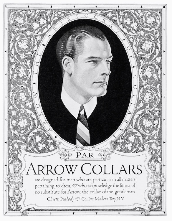
The second of these is the Arrow Collar Man: The site’s write-up:
If you were a man living in the early part of 20th century America, you probably knew who the Arrow Collar Man was. Created in 1905, the Arrow Collar Man was the name given to various male models who appeared in magazine and billboard advertisements for Arrow collars and shirts. Illustrator J.C. Leyendecker was the artist behind the ads. His unique artistic style gave the Arrow Collar Man a very angular, modern, and American look. The men always had very squared-off, masculine jaw lines with perfectly coiffed hair. The ads were designed to create a feeling of success, sophistication, and masculine virility in customers.
(#2)
From 1905 to 1931, the Arrow Collar Man was an American cultural icon. President Theodore Roosevelt said that the Arrow Man was “a superb portrait of the common man.” Women wrote this fictional character love letters by the thousands each week and a few even proposed marriage to him.
The Arrow Man campaign was a huge success. Whenever an ad came out featuring the Arrow Man wearing a new collar, men would be lined up outside of clothing stores to get their hands on the product. By the 1920s, Arrow was selling 4 million collars a week.
The campaign ended in 1931 and is hailed by many advertisers as one of the most successful ad campaigns in history.
The full set of 11 Manliest Brand Icons:
Dos Equis Most Interesting Man in the World
The Arrow Collar Man
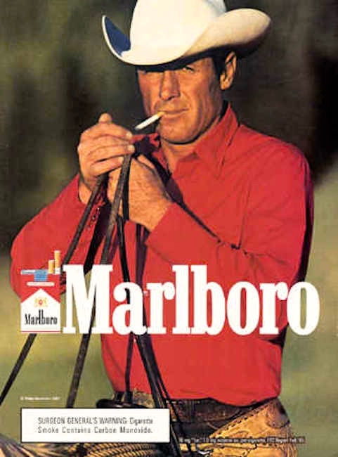
The Marlboro Man
Mr. Clean
The Man in the Hathaway Shirt
Old Spice Man Your Man Can Smell Like
Commander Whitehead: The Schweppes Man
The Gorton’s Fisherman
The Camel Where a Man Belongs Man
John Jameson
The Brawny Man
The Arrow Collar Man was sophisticated, but many of JCL’s other creations were rugged and athletic. Several of the icons are notably rugged — strikingly, the Marlboro Man:
(#3)
For a full 6 of the 11 icons, their manliness is conveyed in part through facial hair of one kind or another: the icons for Dos Equis, Schweppes, Gorton’s, Camels, Jameson’s, and Brawny.
JCL’s homoeroticism. Not ony were JCL’s depictions of men often homoerotic, JCL was himself homosexual. See the discussion in my 7/10/20 posting “Hiding homosexuality: JCL”, with this inventory of my earlier postings about the artist:
— on 1/22/11 in “J. C. Leyendecker”: 5 examples
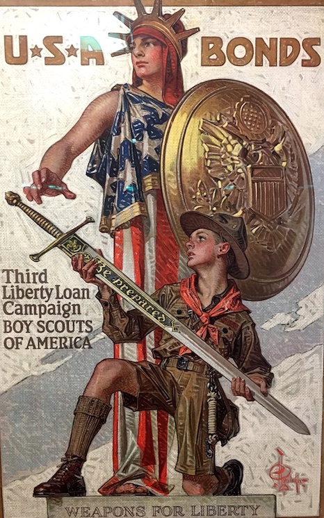
— on 8/6/17 in “Words as weapons, images as ideas”: #4 there is a JCL homoerotic war poster [phallic symbols, shapely male buttocks]:
(#4)
and #10 there a Liberty Loan poster [phallic symbol being handled]:
(#5)
His specialty was commercial illustration, mostly for men’s fashion, and he produced many subtly or not-so-subtly homoerotic illustrations
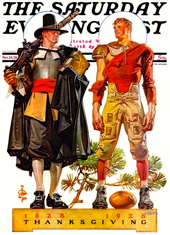
— on 11/28/19 in “All thanks to HomoEros”: #1 is a JCL homoerotic Thanksgiving Saturday Evening Post cover:
(#6)
(Some discussion of the symbolism here in that posting.)

Leave a Reply