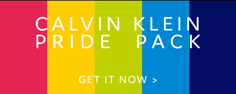
CK special for Pride Month:
 (#1)
(#1)
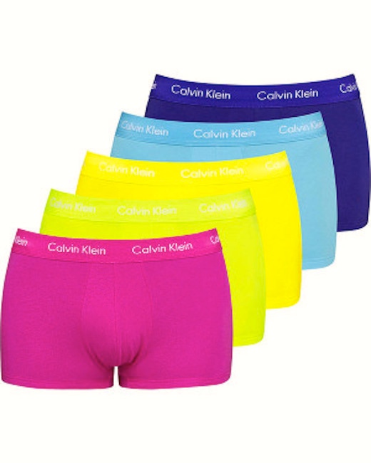
(#2) Pride Trunks
In five neon colors: pink, yellow, lime green, aquamarine, dark blue.
The color bar in #1 is red, but the actual trunks are pink pink pink:

(#3) The male body as a staging ground for Hot. Pink. Trunks.
The pink apparently represents both red and purple in the rainbow, and orange is missing. CK is offering a (rather eccentric) collection of colors from the rainbow. Similarly, the Jungle Flossers in my June 10th posting “Rainbow moments”, which are tetrachromatic: the “inner four” colors of the current Pride flag, with red and purple omitted.
From Daily Jocks on the 12th, about the CK trunks:
Celebrate love with Calvin Klein’s limited edition Pride Trunks 5-Pack. Each pair is made from premium stretch cotton for optimal comfort and finished with the signature brushed logo waistband. – Classic trunk fit – Stretch cotton for comfort and shape retention – Limited edition assorted rainbow colours – Brushed elastic waistband with logo – Low-rise waist – 5-Pack
Nothing says love like tight-fitting trunks in neon colors.
So much for the reduced-hue rainbows, the tetrachromatic Jungle Flossers and the pentachromatic Pride Trunks. At the other end of the scale, Gilbert Baker’s original Pride Flag, this octochromatic delight:
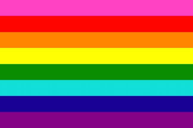
(#4) Eight-stripe version designed by Gilbert Baker in 1978, with colors labeled: hot pink, red, orange, yellow, green, turquoise, indigo, violet (yes, the stripe labeled indigo is very blue-like)
#4 was succeeded by a heptachromatic version (1978–79), with hot pink removed due to fabric unavailability:
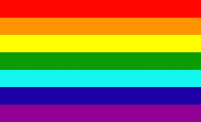
(#5) Essentially the Newton spectrum, but with turquoise in the position of Newton’s indigo
From Wikipedia:
[Isaac] Newton divided the spectrum into seven named colors: red, orange, yellow, green, blue, indigo, and violet. He chose seven colors out of a belief, derived from the ancient Greek sophists, of there being a connection between the colors, the musical notes, the known objects in the solar system, and the days of the week. The human eye is relatively insensitive to indigo’s frequencies, and some people who have otherwise-good vision cannot distinguish indigo from blue and violet. For this reason, some later commentators, including Isaac Asimov, have suggested that indigo should not be regarded as a color in its own right but merely as a shade of blue or violet. However, the evidence indicates that what Newton meant by “indigo” and “blue” does not correspond to the modern meanings of those color words. Comparing Newton’s observation of prismatic colors to a color image of the visible light spectrum shows that “indigo” corresponds to what is today called blue, whereas “blue” corresponds to cyan.
The problematic hue distinctions and labeling choices largely vanish with the last revision of the Pride flag, to the hexachromatic version popular since 1979, in which the stripes labeled indigo and turquoise were replaced by a single (royal) blue stripe; the result is the six central colors of the color wheel — primary red, yellow, and blue; and secondary orange, green, and purple:
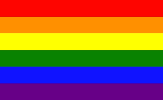
(#6) Les Six Magnifiques
This is where we are now, with occasional playful variations, and also efforts to expand the flag to be more inclusive of everyone in the lgtb world.
Leave a Reply