The 6/1 Zippy strip celebrates a vibrant life on the side of the road, in drive-in joints offering comfort food and in flashy highway motels, in the lost days of mid-20th-century America (think HoJo’s clam strips):
(#1) Stunned by signage: an octogenarian’s bulletin from the golden days; the cartoonist Bill Griffith was born in 1944, I was born in 1940, so this was the time of our youth
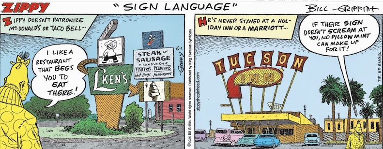
Remembrance of lost time: L-Ken’s Drive-In Restaurant in Colonie NY (a northern suburb of Albany, the state capital) was demolished on 4/20/17; the Tucson Inn, in Arizona’s second city, was demolished in April 2025. Both were famed for their neon signs (cartooned above).
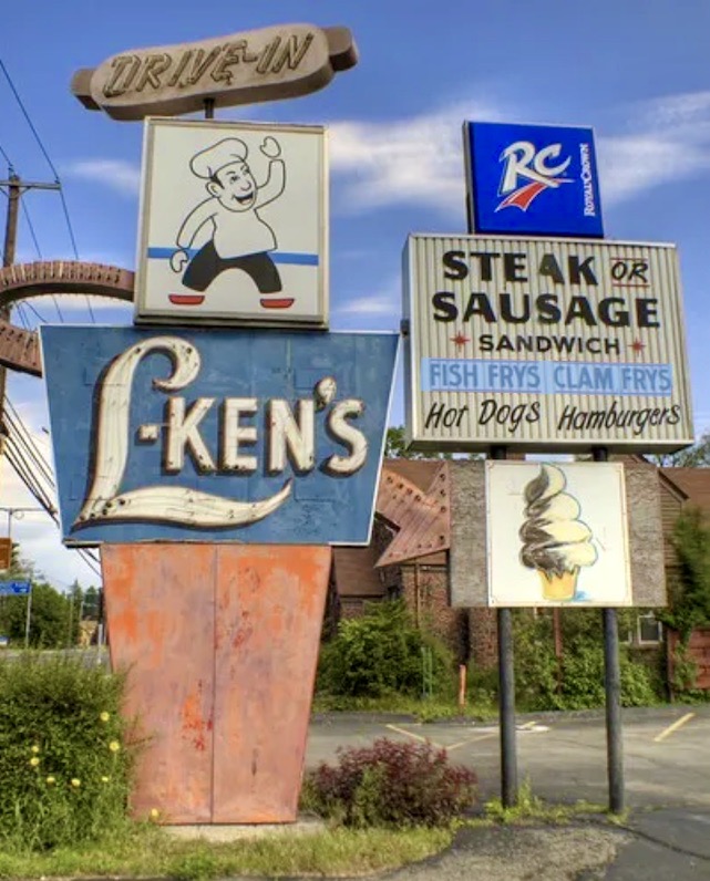
Signage 1. From Chuck Miller’s Chuck the Writer blog, “Memories of L-Ken’s…” from 1/5/11:
(#2) Photo of L-Ken’s taken by Chuck Miller in May 2009L-Ken’s has been shuttered for years. The serving area is strewn with graffiti tags; the parking lot is starting to buckle.
But I wanted to capture the memories of the iconic neon sign that drew people into the family eatery. I wanted to recall the picnic tables that people sat at as they noshed on fish fry sandwiches and tasty clam rolls with tartar sauce. It was comfort food for those who lived north of Colonie Center; Kurver Kreme was for those who lived south of Colonie Center.
Signage 2. From Wikipedia:
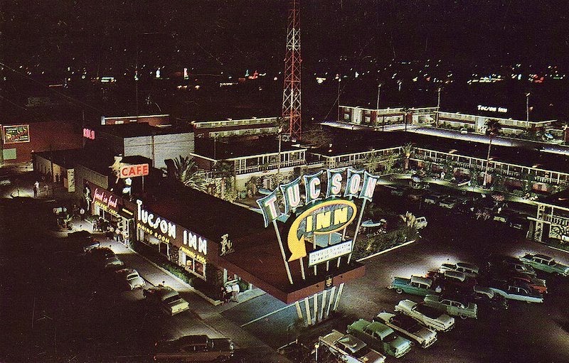
(#3) The Tucson Inn at nightThe Tucson Inn was a motel located in Tucson, Arizona, in an area now known as the Miracle Mile Historic District. The motel was built in 1953 in the Googie architecture and Modernist style, and is an example of historic 1950s Mid-century modern highway motel architecture.
Intended to attract tourists and overnight motorists crossing the country on U.S. Route 80 and U.S. Route 89, the building was one of Tucson’s largest motor hotels when it was constructed. The luxury inn was designed by Anne Jackson Rysdale, the only registered female architect in Arizona at the time. The architecture typifies classic, clean modernism paired with the boisterous exuberance of midcentury industrial design as exemplified by the monumental neon sign.
From my 12/4/09 posting “Weekend comics 2: Googie”:
Googie … the name of an architectural style of the 1950s and 60s, named after the L.A. coffee shop Googie’s (now demolished). There’s a Wikipedia entry, with pictures.
And from Wikipedia:
Modern architecture, also called modernist architecture, or the modern movement, is an architectural movement and style that was prominent in the 20th century, between the earlier Art Deco and later postmodern movements. Modern architecture was based upon new and innovative technologies of construction (particularly the use of glass, steel, and concrete); the principle of functionalism (i.e. that form should follow function); an embrace of minimalism; and a rejection of ornament.
… The movement emerged in the first half of the 20th century and became dominant after World War II until the 1980s, when it was gradually replaced as the principal style for institutional and corporate buildings by postmodern architecture.
Notes on reading signs. From my 7/27/25 posting “Reading signs”:
Signs can provide five things, in more or less pure form, or of course, with mixed motives:
artwork; entertainment (verbal or visual, or, in cartoon form, both; advertising; information (Turn Left at Albuquerque); regulation
The regulations, in turn, can be warnings (Hitchhikers May Be Escaped Convicts [Oklahoma road sign], Beware of Dog), limitations, or prohibitions; the latter two tend to be related as two sides of the coin …, and warnings and prohibitions often come together as a package (Loose Rocks / No Climbing), with the warning serving as a reason for the prohibition.
You will see that the signs in #2 and #3 provide artwork, entertainment, advertising, and information, all mingled together. Vernacular semiotic patchworks, monuments of the ordinary — which is why people remembered them and valued them. And now mourn their disappearance.
Leave a Reply