Gorgeous, sensuous men and glamorous, decadent women, in the drawings of Mel Odom (born 9/2/50), sampled recently on Pinterest (whose bots have divined some of my tastes) — but especially, men in the Odom brand of homomasculinity: queer, perverse, beautiful. Odom explicitly recognizes the erotic art of Aubrey Beardsley as an antecedent and counterposes his soft-edged homomasculinity to a harder-edged variety in homoerotic physique magazines, and, ultimately, in the hypermuscular, hypersexual drawings of ToF, sometimes characterizing himself as the anti-Tom of Finland.
I start with an Artforum April 2019 review by Alex Jovanovich of Odom’s “Gorgeous” solo exhibition at Daniel Cooney Fine Art (in the Chelsea neighborhood of NYC), 1/10 to 2/23 in 2019:
“An addict of beauty” is what the novelist Edmund White dubbed Mel Odom during a public conversation only days after the artist’s solo exhibition, aptly titled “Gorgeous,” opened. White would know, because he’s an expert on the subject. And so is Odom, a maker of ethereal images that depict splendidly chiseled men and glamorous women who appear as though they’ve been tenderly reinforced with light. Thirty-five of his modestly sized drawings (the largest of which are only fourteen inches high), produced between 1975 and 2018, made up this show.
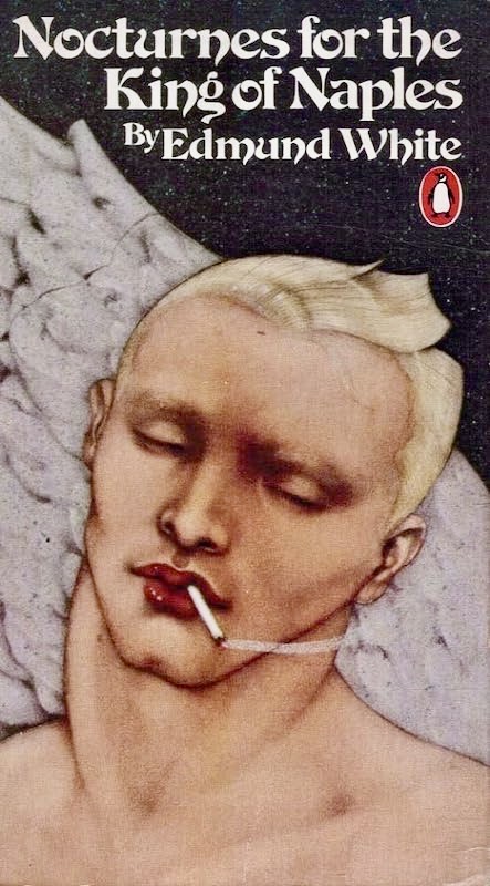
Odom came to fame in the 1970s as a commercial illustrator and retired from the business in 1996. His stunning portraits — many of them rendered in a combination of gouache, pencil, and Peerless-brand dyes — have graced the book covers of mystery writer Ruth Rendell, vampire queen Anne Rice, and White himself.
(#1) Odom book cover for WhiteThey’ve also materialized in an array of magazines, such as the gay beefcake rag Blueboy, the sci-fi periodical Omni, Playboy, and Rolling Stone.
(#2)
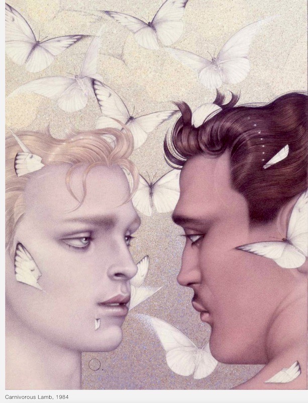
… If you were a child of the 1970s and ’80s, seeing the show brought on a certain déjà vu. With their sateen complexions, high-contrast blushes, full lips, Pre-Raphaelite contours, and Masaccio coloring, Odom’s people seemed very familiar, putting the viewer in mind of Boy George’s commedia dell’arte makeup; the music video for Visage’s 1980 synth-pop hit, “Fade to Grey”; Serge Lutens’s mescaline-tinged ads for Shiseido cosmetics; or Joan Collins as Alexis Colby, Dynasty’s heavily shoulder-padded and mascaraed villainess.
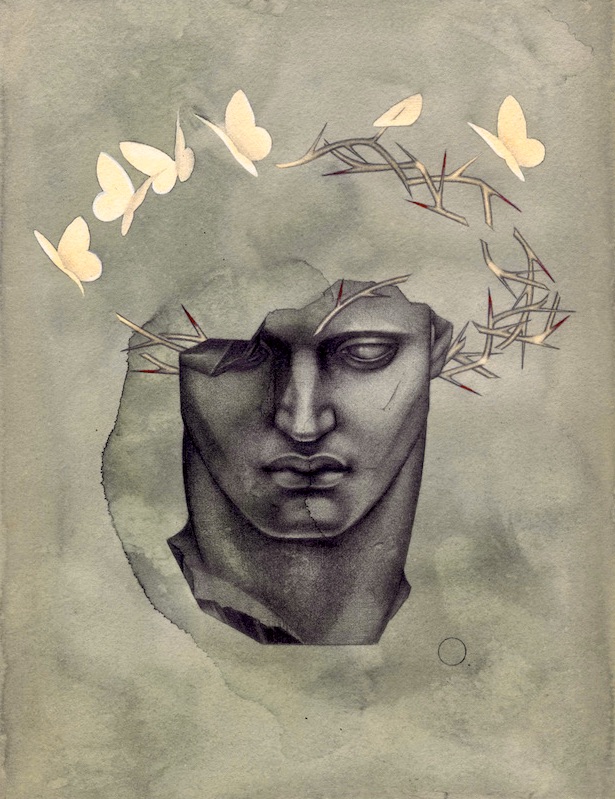
… The surfaces of his exquisite portraits are marmoreal, possessing the quiet sheen of a headstone, or a face washed by tears. Crown of Wings, 1988, is a moving depiction of a Christlike figure, bathed in dour greens and haloed by phantom butterflies that flit perilously close to a strand of thorns.
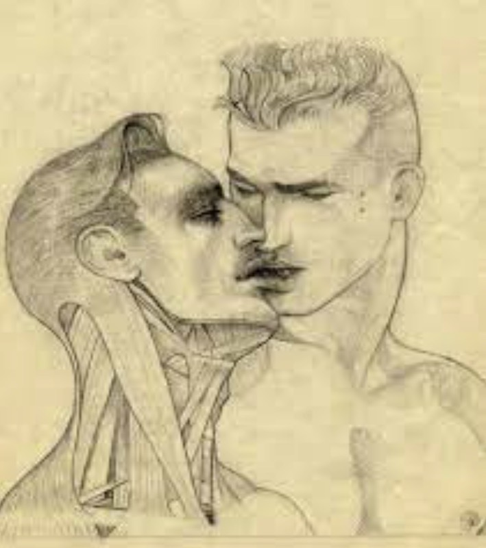
(#3) Crown of WingsHard Kiss, ca. 1980, features a couple of handsome men engaged in the titular act. One of them, however, has a flayed neck, revealing a disturbing arrangement of scrupulously drawn sinews and muscles.
(#4) Hard KissPerhaps the saddest piece in the show — and, by extension, the most infuriating — was a graphite sketch, ca. 1980, of two men enmeshed in a sensuous kiss.
(#5)
The word THEM! is emblazoned in jagged letters across the top of the image, as if the drawing were a rough layout of a poster for a 1950s creature feature. But the real monstrosity of the thing lies in the conditions of its making: a time of unrepentant ignorance and rabid homophobia.
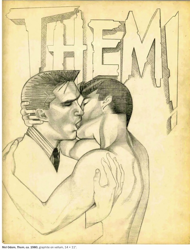
That was 1980, but this drawing responds defiantly to hateful attitudes that were in full flower in the 1950s and 1960s. To which Odom’s generation (and mine) reacted publicly in the 1970s. And then in 1981 the global HIV/AIDS epidemic began, and things got much worse. A few of us survived into a new age, with real advances, and now a threatening backlash of hate and repression envelopes us, so Odom’s angry Them from over 40 years ago is fresh again. (As a housebound, and ever more solitary, queer — wearing my FAGGOT t-shirt today, but without an audience — I no longer have to deal face-to-face with people who wish me dead, but Odom is still out in the world.)
Finally, two background notes, on Odom’s seeing himself as lying between affectionate homage to Aubrey Beardsley and fierce rejection of Tom of Finland. It’s important here that Odom’s background is an an illustrator, with his framings of men’s faces and bodies linked to the homoerotic athletic masculinity of, say, the illustrator J.C. Leyendecker (who died about when Odom was born), but also to the even earlier “aesthetic movement”, which valued artifice and (“feminine”) elegance — in the illustrator Beardsley’s case with strong undertones of perverse homoeroticism. ToF, on the other hand, was not an illustrator of books or commercial advertising, but a frank pornographer, depicting the objects of his own sexual desires. Commercial illustration and pornography are both genres of popular functional art, but with rather different functions, and it would be a mistake to expect one to serve the functions of the other. More below.
Beardsley. From Wikipedia:
Aubrey Vincent Beardsley (21 August 1872 – 16 March 1898) was an English illustrator and author. His black ink drawings were influenced by Japanese woodcuts, and depicted the grotesque, the decadent, and the erotic. He was a leading figure in the aesthetic movement which also included Oscar Wilde and James McNeill Whistler.
… Beardsley was the most controversial artist of the Art Nouveau era, renowned for his dark and perverse images and grotesque erotica, which were the main themes of his later work.
Beardsley’s illustrations are largely populated by female figures in flowing costumes. The male characters — even King Arthur — almost all have delicate features; viewed with modern eyes, most of them look fem. And that’s delightful in its own, somewhat perverse fashion.
In contrast, the men in Odom’s work are mostly strikingly butch (lots of square jaws and angular faces), but beautiful (and sometimes they come in a cloud of butterflies, which Leyendecker would never have risked). Meanwhile, Odom’s women are also strikingly butch, but beautiful, hot in a way no Beardsley woman was.
In any case, the two aesthetics seem stunningly different to me.
Tom of Finland. Since it’s gay pornography, ToF’s world is almost entirely male, and since it’s fantasy, hypermasculine. But his art evolved over time, from working out the secret sexual fantasies of a queer kid to embracing a much more complex world. The mature form of his work as described in my 9/15/20 posting “Tom of Finland at 100”:
ToF is flagrantly about huge penises and muscular buttocks, and about intense sex between men, but (more important) also about the emotional relationships beween those men. It’s all extravagant fantasy, but also a celebration of gay male desire and affiliation in all of its forms, and so it has provided reassurance to untold numbers of gay men who scarcely resemble the fantasy sexually heroic figures of ToF — we are, variously, indetectable in the straight world and effeminate and dorky and little-dicked and horse-dicked and insecure and out-and-proud and full of shame — but can find in these figures validation of their desires and practices (notably, receptive anal intercourse: Real Men Take It Up the Ass). Plus, a lot of it is funny.
And that is still another aesthetic.
[Addendum 12/29, on functional art. From my 2/13/20 posting “Lincoln Darwin Valentine Day”:
[about genres of] popular functional art. There are admirable tv commercials, sitcoms, cartoons, film noir, horror movies, background music, comic routines, devotional songs, items of everyday clothing, household furnishings, and much much more, including several kinds of pornography. Things can be done crudely, or routinely, or with style. I do like to encourage people to look for style and craft in gay porn.
As in ToF, especially his mature style.]
.
Leave a Reply