Yesterday’s Zits:
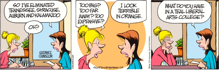
Some other orange schools: Florida, Princeton, Univ. of Miami, Oregon State, Idaho State, Oklahoma State. There’s also a bunch of schools with gold — but that’s yellow-orange, not straightforwardly orange. As for teal: Eckerd College, UNC-Wilmington, Coastal Carolina. Scripps has sea-foam green, which is very close to teal. (In any case, teal isn’t a basic color word in English, while orange is, so there’s a big imbalance here.)
There’s a suggestion in the strip that choosing a college on the basis of the school colors is silly, frivolous, inconsequential — the sort of thing an air-headed girl would do. I don’t see that it’s any more frivolous than choosing a college on the basis of the current fortunes of the football and basketball teams. (Please don’t just baldly assert that sports are important, serious, and fashion isn’t.)
November 30, 2016 at 11:45 am |
Suggests an interesting thread–your readers’ odd reasons for selecting a college. I chose mine (Leeds University) because at the time it was one of very few cities left in the UK that still had an electric tram service. I was very right since they gave me a great deal of joy in between lectures and other activities.
December 1, 2016 at 5:47 am |
Have there been any studies lately on the basic color term-ness of “teal?” I did a quick look at Google Scholar but didn’t see anything specifically about it. My impression is that it’s rapidly becoming one if it isn’t one already (to me it feels as incorrect to say “teal is a kind of blue” – or “teal is a kind of green,” for that matter – as it does to say “pink is a kind of red” or “gray is a kind of black”); in other words, that it’s a generational divide.
December 1, 2016 at 2:06 pm |
teal is far far from basic color word status. If you ask people to name color words, teal is way down the list, in the region with:
beige, sepia, azure, scarlet, coral, mauve, fuchsia, ecru, maize, ivory, jade
But yes, people have trouble saying that teal is a kind of blue or that teal is a kind of green, but that’s because there’s so little territory between the BLUE and GREEN categories; turquoise, aquamarine, cerulean, and seafoam are similarly problematic.