One of my favorites in Martin Parr’s Boring Postcards USA:

Parr’s collection (a counterpart to his U.K. collection, entitled simply Boring Postcards) takes us around the U.S. though its highways (especially turnpikes and interstates), main streets, shopping centers, motels (inside and out), company headquarters and plants, campus buildings, military installations, airports, banks, and restaurants. There’s an automotive theme throughout
But … picturesque?
Another example of scenic beauty:
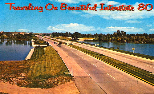
(At least there’s some water in this one.)
From the amazon.com U.S. website:
In effect, Boring Postcards was an alternative social and cultural history of Britain from the 1950s to the 1970s. Martin Parr subsequently turned his attention to the United States to produce Boring Postcards USA, 160 of the dullest postcards from the land of opportunity. Just as before, for a postcard to qualify as sufficiently ‘boring’, either its composition, or its content, or the characters featured, must be arguably boring, or the photograph must be absent of anything which might conventionally be described as interesting. The postcards in Boring Postcards USA include: ‘Site of Proposed Larger Taconite Plant’ (a field); ‘The colourful rug near the entrance of the national offices of the American Baptist Churches’ (a red rug); ‘Sunset Travel Trailer Park’ (some trailers); ‘Pennsylvania Turnpike near the Philadelphia Interchange’ (exactly what it says); ‘Ariel View of the massive interchange complex of Federal Highways 1-75, 1-85, and I-20.’ Once again, the design of the book reflects its contents by being at the cutting edge of dullness, sporting a neutral grey cover and captions in Helvetica, the typeface of choice for producers of boring postcards. Once again, these cards will provide not only a great deal of amusement but a commentary of how America has changed, a celebration of those places that have been forgotten by conventional history.
(Viewing these cards, you feel that you’ve fallen into an Edward Hopper scene, but without the human interest.)
Part of the problem is that some scenes just don’t make good subjects for still photographs, and highways are certainly one of these. Even I-280, the Junipero Serra Freeway, which runs down the west side of the San Francisco peninsula and bills itself (with some justification) as “The World’s Most Beautiful Freeway”, doesn’t show up well in postcards; mostly you get strips of roadway and exit signs.
Another part of the problem is the choice of subjects in the first place. For the most part, these were picked for postcards not because they are aesthetically pleasing, but because they embody public or commercial pride. The enormous number of roadway cards — in real life, not just in Parr’s collections — reflects public pride in the development of the great national road systems, in the U.K. as well as the U.S. Similarly, the airports and main streets and shopping centers and company headquarters. And of course there’s a lot of self-promotion in those cards of motels, banks, and restaurants (not to mention car washes and the like). These scenes are “picturesque” because they’re considered to be suitable for pictures, to be representative of particular places.
(Some cards are hugely more boring than they would have to be. I’ve been collecting dumb cards to send to friends for decades now, and some of them are remarkable. The most readily available postcard of Menlo Park CA shows a city parking garage — I assume because a street scene would show commercial establishments and thus favor some businesses over others. And I never found cards of Flagstaff AZ that even hinted at the charm of the city’s downtown.)
Some words on the adjective and noun picturesque, from OED3 (March 2006). The adjective:
Having the elements or qualities of a picture; suitable for a picture; spec. (of a view, landscape, etc.) pleasing or striking in appearance; scenic. Now freq. in weakened sense (sometimes depreciative or ironic): pretty in an undeveloped or old-fashioned way; charming, quaint, unspoilt.
First cite in 1705, then two important cites:
1749 U. ap Rhys Tour Spain & Portugal 86 The Ends of their Veils‥tied in so pretty a Manner, as to render their Figures extremely pittoresque.
1768 W. Gilpin (title) An essay upon prints; containing remarks upon the principles of picturesque beauty.
The reference here is to the 18th and 19th British Romantic notion of picturesque beauty, with its component of wild, even threatening, nature. This is even clearer in the OED‘s noun entry:
With the. That which is picturesque; picturesque elements or qualities collectively; picturesqueness.
In the late 18th cent. the picturesque was considered an aesthetic category alongside beauty and sublimity (as established by Burke), associated with the roughness and irregularity of nature harmonized by composition.
Early cites:
1749 D. Hartley Observ. Man i. 427 The Nature of the Caricatura, Burlesque, Grotesque, Picturesque, &c.
1782 W. Gilpin Observ. River Wye 93 Col. Mitford‥is well-versed in the theory of the picturesque.
1794 U. Price (title) An essay on the picturesque, as compared with the sublime and the beautiful.
William Gilpin, who appears in both sets of early cites, is the central early figure. From Wikipedia:
Picturesque is an aesthetic ideal introduced into English cultural debate in 1782 by William Gilpin in Observations on the River Wye, and Several Parts of South Wales, etc. Relative Chiefly to Picturesque Beauty; made in the Summer of the Year 1770, a practical book which instructed England’s leisured travelers to examine “the face of a country by the rules of picturesque beauty”.
… Picturesque arose as a mediator between the opposed ideals of beauty and the sublime, showing the possibilities that existed in between these two rationally idealized states. As Thomas Gray wrote in 1765 of the Scottish Highlands “The mountains are ecstatic.. None but God know how to join so much beauty with so much horror.”
A century later came the monuments to the picturesque in art:
Picturesque Europe was a three-volume, lavishly illustrated set of books published by Cassell, Petter, Galpin & Co. of London, Paris and New York in 1875. The books depicted tourist haunts in Europe, with text descriptions and steel and wood engravings by eminent artists of the time (link)
Picturesque America was a two-volume set of books describing and illustrating the scenery of America, published by D. Appleton and Company of New York in 1872 and 1874 and edited by the romantic poet and journalist William Cullen Bryant (1794-1878), who also edited the New York Evening Post. The layout and concept was similar to that of Picturesque Europe. The work’s essays, together with its nine hundred wood engravings and fifty steel engravings, are considered to have had a profound influence on the growth of tourism and the historic preservation movement in the United States. (link)
Then, as the OED definition notes, the wildness begins to drain from picturesque, which comes to be used for scenes that are merely pretty or quaint. And eventually, to judge from Picturesque Indiana and Beautiful I-80, for scenes that might be considered to be interesting for qualities other than the aesthetic.
March 11, 2012 at 6:46 pm |
To pick a nit, I-280 lies west of most of the peninsula’s cities, but most if not all of it is east of the watershed between bay and ocean (and east of the San Andreas).
March 11, 2012 at 6:53 pm |
Well, yes, that’s a gigantic nit. Remember that I write these postings for people all over the world, and my very brief account of where I-280 runs is, I think, exactly at the right level for this audience.
For more details, I gave a Wikipedia link.
March 13, 2012 at 11:56 am |
I’m reminded of Henry Tilney’s lessons on the picturesque to Catherine Moreland in *Northanger Abbey* (and indeed, some of Marianne Dashwood’s -er- gushings in *Sense and Sensibility). I suspect all of them would be gobsmacked by any of the boring postcards you mention. Though I try not send you any cards that could be described as boring myself, even if not picture-skew.