From Joe Transue on Facebook on 2/12, as a comment on my 2/11 posting “On the faux-Hopper watch”, about Waiting for the train (an image that was merely inspired by Edward Hopper (1892-1967), not actually by him):
(#1) JT reported that this image came up on his feed out of nowhere, with the label: Edward Hopper. Locomotive 1944; there’s a lot to be said here, but one thing is absolutely clear: it is not a painting by Hopper; there are excellent catalogs of Hopper’s paintings, and neither this image (or anything like it) or this title (or anything like it) appears in the catalogs — but then it turns out that Hopper spent years (resentfully) churning out illustrations, for magazines and for advertisements, just to pay his bills, and these haven’t been catalogued, so who knows?

More things that are absolutely clear: that this image was in fact used in an ad (in Life magazine) in 1944, for ALCO (the American Locomotive Company); that the locomotive in the ad is an ALCO DL-109 diesel engine built between late 1939 and the spring of 1944; and that this ad appeared at a time when Hopper had been recognized as a major figure in American art and was in the midst of one of his most productive periods (in the 1930s and early 1940s, he painted New York Movie (1939), Girlie Show (1941), Nighthawks (1942), Hotel Lobby (1943), and Morning in a City (1944), among others), and cannot imaginably have been resorting to commercial illustration to pay his bills in 1944.
So where does #1 come from?
[Digression. Joe Transue, who is he? My nephew-in-law, my husband-equivalent Jacques Transue’s nephew — Joe is Jacques’s (older) brother Bill’s (younger) son. (I am entertained by the fact that Joe’s wife Amy Thompson is my niece-in-law-in-law.)]
The 1944 Life ad. A copy of the whole ad, image plus text:
(#2) Seeing the image in this context made me see just how much it was a fanciful ad illustration, not at all realistic (much less heightened magic-realistic) in the fashion of Hopper’s paintings; the human figures and the background scenery are cartoonish, and the locomotive itself looks like a Streamline Moderne fantasy train

Now, about that locomotive. First, the company, from Wikipedia:
The American Locomotive Company (often shortened to ALCO, ALCo or Alco) was an American manufacturer that operated from 1901 to 1969, initially specializing in the production of locomotives but later diversifying and fabricating at various times diesel generators, automobiles, steel, tanks, munitions, oil-production equipment, as well as heat exchangers for nuclear power plants.
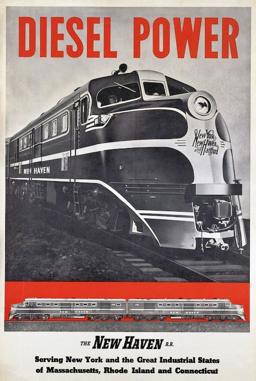
Then the specific locomotive, again from Wikipedia (which clearly has some serious railfans contributing to it):
The ALCO DL-109 was one of six models of A1A-A1A diesel locomotives built to haul passenger trains by the American Locomotive Company (ALCO) between December, 1939 and April, 1945 (“DL” stands for Diesel Locomotive). [further details follow]
And an exemplar of the DL-109 that might have served as the model for the engine in the ad:
(#3) An actual DL-109, in service on the New Haven R.R. at the time; the locomotive was not in fact red, but it was a Streamline Moderne design
From Wikipedia:
Streamline Moderne is an international style of Art Deco architecture and design that emerged in the 1930s. Inspired by aerodynamic design, it emphasized curving forms, long horizontal lines, and sometimes nautical elements. In industrial design, it was used in railroad locomotives, telephones, buses, appliances, and other devices to give the impression of sleekness and modernity.
Now compare #3 and #1. #3 is recognizably Streamline Moderne, but #1 notches everything up several degrees: longer, lower, sleeker, but also bigger and brighter. The Busby Berkeley dancers must be right around the corner.
In any case, #1 was created for ALCO in the early 1940s, surely not by Hopper. Also not by AI, since there was no such thing then. But there were ways of doctoring photographs and drawings.
In any case, it seems to me that the most likely source of #1 is a commercial illustrator using #3 or something very like it as the inspiration for the engine in the ad, supplying it with a cartoonishly Hopperesque context (the railway station and the landscape background), taking advantage of the great success of Hopper’s paintings from this period, which got a lot of press coverage. Streamline Moderne was in the air, and so was Edward Hopper.
Later, then, #1, extracted from its context in #2, got identified as a Hopper work because it sort of looked like a Hopper.
An alternative story. In which someone re-works one of Hopper’s commercial illustrations from the early days of his career (up to the mid-1920s) to create #1. I’ll first note this observation from Hopper’s Wikipedia page:
In 1905, Hopper landed a part-time job with an advertising agency, where he created cover designs for trade magazines. Hopper came to detest illustration. He was bound to it by economic necessity until the mid-1920s.
Then I’ll quote from a piece on the Literary Hub site, “The Unlikely Pulp Fiction Illustrations of Edward Hopper: When the Iconic Painter Drew Cowboys for Adventure Magazine” by Daniel Crown on 3/5/18:
In the winter of 1956, Alexander Eliot, art critic for Time magazine, interviewed Edward Hopper for a cover feature on the painter’s roundabout path to fame. Intended to familiarize general audiences with the man behind classic paintings like Nighthawks and Early Sunday Morning, the resultant profile reads today like a paean to an American master. Eliot was taken with Hopper’s “unalterable reserve.” Presenting the artist as a frugal and unsentimental old man who often conflated self-effacement and self-flagellation, he painted his own portrait of a folksy messiah — a humble savant capable of rescuing American realism from a clique of “clattering egos.”
Given this messianic tilt, it’s not surprising that as Eliot broached Hopper’s early days as a commercial artist, he referred to the period as his “time in the desert.” For the first 25 years of his career, Eliot related, Hopper had failed to support himself solely on his painting and therefore paid his bills drawing covers and interior art for publications like Hotel Management, Everybody’s Magazine, and the Wells Fargo Messenger. Eliot spun this existence into a retroactive tragedy. Advertising firms and publishing houses had wanted America’s greatest living realist to “draw storybook characters posturing and grimacing.” Hopper had simply wanted to “paint sunlight on the side of a house.”
To Eliot’s credit, 60 years later, art historians still struggle to reconcile the most sensational of Hopper’s commercial illustrations with the quiescent scenes that earned him a place among the great 20th-century artists. Hopper biographer Gail Levin described this squaring-up process in 1979; while many of the artist’s commissioned illustrations allowed him to perfect subjects “in which he was especially prolific” — offices, ships, railroads [AMZ: emphasis mine], hotels, and restaurant scenes — several forced him to confront unfamiliar and at times uncomfortable themes.
Nowhere was this more evident than in his work for the pulp-fiction magazine Adventure.
… As Levin wrote in 1979, Hopper’s attitude toward illustrating was “the antithesis of that of popular illustrator Norman Rockwell” [AMZ: or of the celebrated illustrator N. C. Wyeth]. He never aimed to elevate illustration to a high-brow artform, nor did he view the work as anything more than a paycheck. Hopper himself described this mindset to Eliot in 1956. As a freelancer, he recalled, he often dropped by unannounced at a publication’s office with a portfolio tucked beneath his arm. “Sometimes I’d walk around the block a couple of times before I’d go in,” Hopper said, “wanting the job for money and at the same time hoping to hell I wouldn’t get the lousy thing.”
The piece provides a number of examples of Hopper’s illustrations for trade publications and Adventure magazine, looking not particularly Hopperesque. No locomotives, unfortunately.
But apparently there’s a big trove of illustrations, and it hasn’t been catalogued. Meanwhile, the illustrations would have been the property of the publications, which were free to file them and re-use them, and presumably to have then re-worked and brought up to date. Which might have been how we got to #1 in 1944.
Leave a Reply