Hana Filip, on Facebook two days ago, voicing her taste in colors, initially about a store, and then about the clothes she wears:
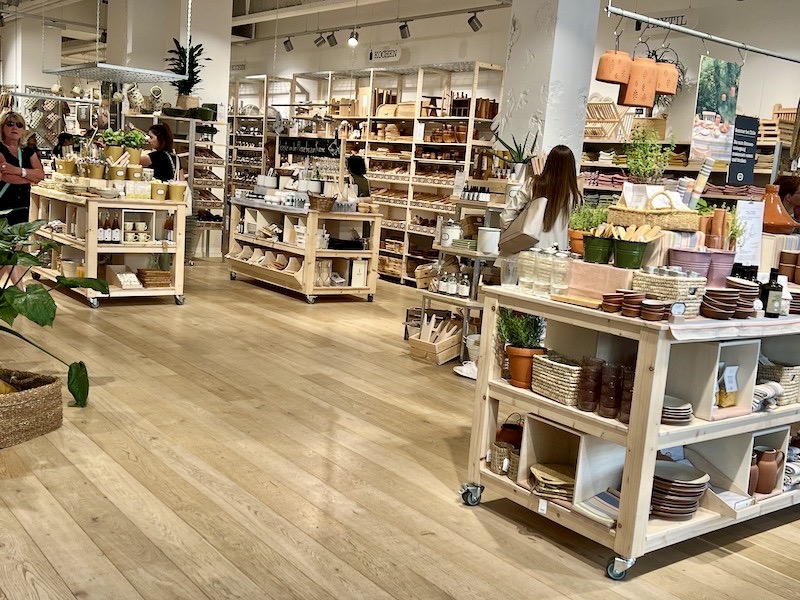
— HF: I’m underwhelmed by this pale-earth-tone fad. The photo renders this unhappy situation in one store in my ‘hood [in Düsseldorf, Germany] more colorful than it looks in reality. I love jewel-tone colors, titian blue, venetian red, alizarin crimson, vermillion, naples yellow, gold ochre, emerald green … pretty bright colors with lovely names.
[Note HF’s preference for lower-casing: titian, venetian, naples rather than the customary Titian, Venetian, Naples.]
The explicit objection is to colors that are both pale (not bright) and earth tones (an earth tone is a warm color — red, yellow, or orange in hue — with a brownish tinge); the examples HF gives are not just bright, but also saturated — colors for which, in my response to HF, I used the term intense (whose opposite is pastel, low in both saturation and brightness).
— AZ > HF: Just reading your roll-call of intense color names gives me a shiver of pleasure. Yes Yes Yes!
Clothing time. The FB discussion also digressed into colors. From Susan Fischer and Hana Filip:
— SF: I look terrible in earth tones; give me strong focal colors every time.
— HF > SF: Me too, washed out, pale, sick. Generally, I find these different shades of pale earth-tones so uninspiring, soporific.
I was going to add my voice at this point, since I look awful — sallow, sickly — in pale earth tones, but I was derailed by SF’s use of focal colors, roughly where I use intense colors. The terms aren’t synonyms, and focal is the wrong descriptor here.
focal vs. intense. Focal colors are those “most exemplary of basic color names in many different languages” (Eleanor Rosch Heider) — color here embracing hue, saturation, and brightness. The focal colors are saturated and bright, but their most relevant property is their hue, so that when people take about “basic color names” and “focal colors” what they’re focusing on is the hues: red, blue, etc.
HF’s preferred colors are saturated (rather than dull) and bright (rather than light, or pale), but not necessarily focal:
ochre — also mustard — is saturated and bright, but too brown to be focal, and so is Venetian red
meanwhile, alizarin crimson lies between focal red and purple (tilting towards the red), and some other intense colors are intermediate between two focal colors and are therefore also non-focal: turquoise, lying between focal blue and green; and magenta, lying between focal red and purple (tilting towards the purple)
Which is why I used intense to refer to colors that are both saturated and bright, rather than focal — using intense roughly as the opposite of pastel, pastel referring to colors that are low in saturation and brightness.
And right now I’m wearing an intense and focal purple t -shirt. A winner on all fronts!
June 6, 2023 at 8:34 am |
I am familiar with pastel and earth colors, but intense is not a common color descriptor in my experience. That does not mean it is wrong, of course, nor do I suppose for a moment that that is the case, but it does make me think that there is probably a synonym for intense colors that I am overlooking. Is there another term for this?
June 6, 2023 at 8:41 am |
I knew of none, and just elevated this one from everyday language to semi-technical term.
June 6, 2023 at 8:44 am |
I neglected to say how much I enjoyed HF’s “lovely names” *as names* — just delicious.
June 6, 2023 at 9:38 am |
I see that Hana Filip is a linguist at Heinrich Heine university in Düsseldorf, Ph.D. from Berkeley. A former student of yours?
June 6, 2023 at 12:03 pm |
Not a student of mine; Berkeley and Stanford are 40 miles by road apart from one another, and are very different institutions. HF is not merely a linguist at Düsseldorf, but the Professor of Semantics there. A generation younger than me, *and* a respected colleague.
From my 1/24/21 posting: It started with a kiss
https://arnoldzwicky.org/2021/01/24/it-started-with-a-kiss/
Then, from my 9/21/21 posting: Guest posting on “How does he sleep at night?”
https://arnoldzwicky.org/2021/09/21/guest-posting-on-how-does-he-sleep-at-night/
June 6, 2023 at 2:53 pm |
From Hana Filip on Facebook, about this posting:
June 6, 2023 at 5:44 pm |
It would take an easterner like me to confuse Berkeley and Stanford!
Trying to think of a Christian Morgenstern poem about tenses. Closest I can think of is “Der Werwolf” which is about cases.
June 7, 2023 at 2:17 am |
Here is the poem by Christian Morgenstern entitled
“Unter Zeiten”
Das Perfekt und das Imperfekt
tranken Sekt.
Sie stießen aufs Futurum an
(was man wohl gelten lassen kann).
Plusquamper und Exaktfutur
grinsten nur.
(1905, Erstausgabe)
seit 1908 lautet die letzte Zeile:
blinzten* nur.
June 7, 2023 at 2:16 am |
Here is the very short poem by Christian Morgenstern, entitled “Unter Zeiten” :
Das Perfekt und das Imperfekt
tranken Sekt.
Sie stießen aufs Futurum an
(was man wohl gelten lassen kann).
Plusquamper und Exaktfutur
grinsten nur.
(1905, Erstausgabe)
seit 1908 lautet die letzte Zeile:
blinzten* nur.