Bruce McCall’s cover for the February 2nd New Yorker:
The cover story:
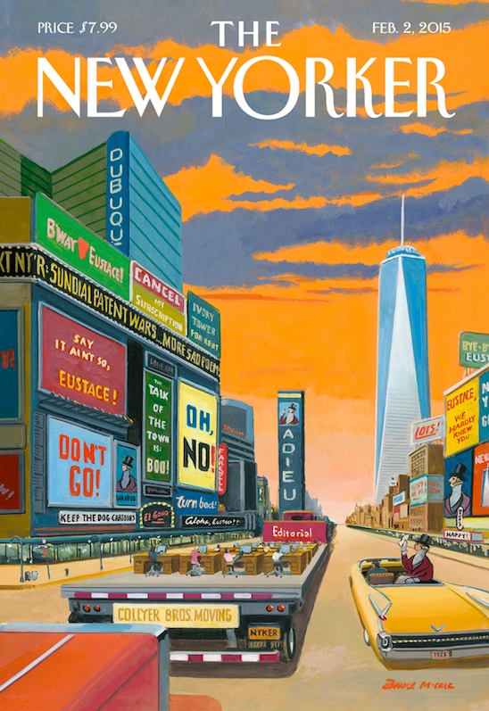
“Last week, the staff of The New Yorker made its final preparations to leave 4 Times Square, its headquarters for the past fifteen years, to join the rest of Condé Nast, the parent company, down at 1 World Trade Center, the new megatower in lower Manhattan,” writes Nick Paumgarten in a Comment titled “Here.” The artist Bruce McCall pictures what it felt like to pack boxes while we were finishing the last issue in our old building.
A note on McCall, then some details from the cover.
From Wikipedia:
Bruce McCall (born 1935) is a Canadian author and illustrator, best known for his frequent contributions to The New Yorker.
Born and raised in Simcoe, Ontario, Canada, he was fascinated by comic books and showed an early aptitude for drawing fantastical flying machines, blimps, bulbous-nosed muscle cars and futuristic dioramas.
… Without any serious technical training, McCall began his illustration career drawing cars for Ford Motor Company in Toronto in the 1950s. After several decades in advertising, he sought opportunities elsewhere in the publishing industry.
He went to New York City, and was hired by National Lampoon and made a name for himself as an artist with intelligent and whimsical humor. McCall also spent a brief period writing sketches for Saturday Night Live.
McCall has illustrated magazine covers, regularly appearing in The New Yorker and other magazines. He has been a contributor to the magazine since 1979.
McCall is also a humourist, and has written essays on some of the social ironies of modern life. He writes frequently for the “Shouts & Murmurs” section of The New Yorker.
McCall lives on the Upper West Side of New York near Central Park.
McCall has become the wry and fanciful chronicler of life in New York. Covers previously on this blog: from 8/19/10 on “The library train to Sauk Center”; and three from 1/26/03 on “Reinventing NYC”.
The New Yorker had three homes, all in Midtown not far from Times Square, before the current move: 25 W. 43rd St. (1935-1991), 20 W. 43rd (1991-1999), and 4 Times Square (1999-2015). The early locations put the magazine at the edge of sleazy, sexy Times Square (alluded to in the cover by the sign SEXIEST), which was replaced by the clean, tourist-friendly Times Square that Disney helped create.
On the role of sex in the area, here’s Frank Rich in the 11/11/01 New York Times Magazine on the prospect of breathing real life into the Disneyfied Times Square:
Sex must also be in the mix. It has always been part of the neighborhood’s DNA. Even before The New York Times moved into Longacre Square in 1904, prompting its name change, the West 40’s were overrun by ”parlor houses.” In 1913, the New Amsterdam’s roof theater — right above the stage where ”The Lion King” prowls now — featured Ziegfeld’s ”Midnight Frolic,” where a trick of lighting on a ”see-through runway” displayed the pulchritude of chorus girls. A decade later the Shubert Theater housed ”Artists and Models,” a revue featuring female frontal nudity. Fiorello La Guardia stamped out the ”incorporated filth” of burlesque in the 1930’s, and his successor in spirit, Rudolph Giuliani, tried to do the same with porn. But there must be a way to get sensible adult sexuality back into Times Square entertainment. It wouldn’t mean importing prostitution, 10-cents-a-dance halls or wretched XXX emporiums, but perhaps at least a touch of Vegas (which also tried to stamp out sex revues in favor of family entertainment in the 1990’s but this year reversed course).
McCall’s cover shows the editorial department being driven south on the back of a flatbed truck, everybody industriously working at their desks. The moving company is Collyer Bros., alluding to the enormous clearing-out project that preceded the actual move. From Wikipedia:
Homer Lusk Collyer (November 6, 1881 – March 21, 1947) and Langley Wakeman Collyer (October 3, 1885 – c. March 9, 1947), known as the Collyer brothers, were two American brothers who became famous because of their bizarre natures and compulsive hoarding.
In the background is a building labeled DUBUQUE, alluding to its founding editor Harold Ross’s pugnacious prospectus for the magazine, parts of which I quote here:
THE NEW YORKER will be a reflection in word and picture of metropolitan life. It will be human. Its general tenor will be one of gaiety, wit and satire, but it will be more than a jester. It will be not what is commonly called sophisticated, in that it will assume a reasonable degree of enlightemenment on the part of its readers. It will hate bunk.
… THE NEW YORKER expects to be distinguished for its illustrations, which will include caricatures, sketches, cartoons and humorous and satirical drawings in keeping with its purpose.
THE NEW YORKER will be the magazine which is not edited for the old lady in Dubuque. It will not be concerned in what she is thinking about. This is not meant in disrespect, but THE NEW YORKER is a magazine avowedly published for a metropolitan audience and thereby will escape an influence which hampers most national publications. It expects a considerable national circulation, but this will come from persons who have a metropolitan interest.
The bulk of the material in McCall’s cover involves sad protesting messages about the loss of the magazine’s Midtown offices — many of them addressed to the iconic Eustace Tilley (whose image appears at least four times in McCall’s cover). From the Wikipedia New Yorker entry:
Eustace Tilley: The magazine’s first cover illustration, a dandy peering at a butterfly through a monocle, was drawn by Rea Irvin, the magazine’s first art editor, based on an 1834 caricature of the then Count d’Orsay which appeared as an illustration in the 11th edition of the Encyclopædia Britannica. The gentleman on the original cover, now referred to as “Eustace Tilley”, is a character created by Corey Ford for The New Yorker. The hero of a series entitled “The Making of a Magazine”, which began on the inside front cover of the August 8 issue that first summer, Tilley was a younger man than the figure on the original cover. His top hat was of a newer style, without the curved brim. He wore a morning coat and striped trousers. Ford borrowed Eustace Tilley’s last name from an aunt — he had always found it vaguely humorous. “Eustace” was selected for euphony, although Ford may have borrowed the name from Eustace Taylor, his fraternity brother from Delta Kappa Epsilon at Columbia College of Columbia University.
The character has become a kind of mascot for The New Yorker, frequently appearing in its pages and on promotional materials. Traditionally, Rea Irvin’s original Tilley cover illustration is used every year on the issue closest to the anniversary date of February 21, though on several occasions a newly drawn variation has been substituted.
Leave a Reply