A day late for the occasion — Epiphany, 1/6, the Feast of the Magi (Caspar, Melchior, and Balthasar) — an occasion in which I have a personal onomastic stake, as Arnold Melchior Zwicky, named for my father, who was named in honor of his father (Melchior Arnold Zwicky), who was, with two of his brothers, named after a Magus: Melchior, in one tradition king of the Persians, the bringer of gold to the Christ child, and the oldest of the three.
All of this was brought to my attention again yesterday, in a Facebook posting by Bert Vaux, which included this vintage advertising poster:
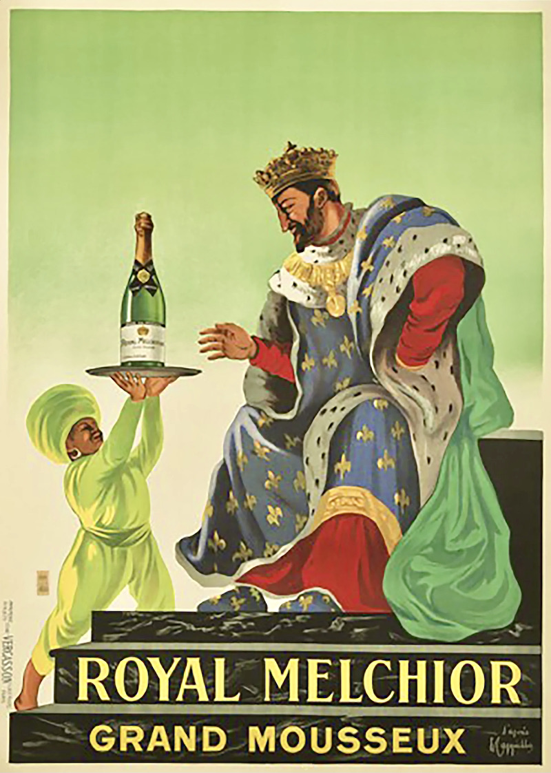
(#1) The Magus Melchior, roi des Perses, serving as advertising eponym and mascot for Royal Melchior vin mousseux (sparkling wine), in a poster (undated, but from early in the 20th century) by Leonetto Cappiello (sadly, this brand of sparkling wine is apparently no longer produced)
Now: refresher notes on Epiphany; and an appreciation of Cappiello.
Naming the day. But first, about names.
The day before Epiphany is Epiphany Eve, aka Twelfth Night — that’s X Eve ‘evening before / day before holiday X’ — but what should we call the day after Epiphany, or more generally the day after holiday X? (There is no established pattern here.) I suggest X Morrow, extending the use of the noun morrow in the morrow. So today would be Epiphany Morrow.
Background from NOAD:
noun morrow: (the morrow) archaic or literary [a] the following day: on the morrow they attacked the city. [b] the time following an event: in the morrow of great victory, will they show some equanimity? [c] the near future: we have the religious enthusiast who takes no thought for the morrow.
Epiphanic notes. My Epiphany posting for this year, yesterday‘s “Commercial Christmas 2021: DJ’s third quarter”, has a section surveying Epiphany on this blog: the postings and the art work. From earlier postings, from NOAD:
noun epiphany (also Epiphany): [a] the manifestation of Christ to the Gentiles as represented by the Magi (Matthew 2:1–12). [b] the festival commemorating the Epiphany on January 6. [c] a manifestation of a divine or supernatural being. [d] a moment of sudden revelation or insight. ORIGIN Middle English: from Greek epiphainein ‘reveal’. The sense relating to the Christian festival is via Old French epiphanie and ecclesiastical Latin epiphania.
(The semantic developments are from sense a separately to b and to c, and then from a and c to d.)
Then, specifically relevant to #1:
noun magus (plural magi): [a] a member of a priestly caste of ancient Persia. See also Magi. [b] a sorcerer. ORIGIN Middle English: via Latin and Greek from Old Persian maguš. [a parallel development led to the noun magic]
Over time the Christian Magi have become some mixture of priests, kings, sorcerers, and (as the Wise Men) seers and scholars. The biblical account is vague on almost every crucial point, so the details have been filled in as the story was retold and merged with existing cultural narratives and practices. As Wikipedia has it:
The single biblical account in Matthew simply presents an event at an unspecified point after Christ’s birth in which an unnumbered party of unnamed “wise men” (μάγοι, mágoi) visits him in a house (οἰκίαν, oikian), not a stable, with only “his mother” mentioned as present.
The number of Magi became traditionally fixed at three, simply because three presents (gold, frankincense, and myrrh) were named in Matthew.
The royal Melchior in #1 is young, broad-shouldered, and virile, not the graybeard of traditional representations. Also powerfully royal: with a crown and pendant of gold, a basic garment in the crimson of royalty and nobility, and over all of it royal robes of France, with an ermine collar and a bleu de France fabric emblazoned with the gold fleurs-de-lis of French royalty. This Melchior is not just any king; he’s the (mythic) king of France.
From Wikipedia on the blue:
Bleu de France (Blue of France) is a colour traditionally used to represent France. Blue has been used in the heraldry of the French monarchy since at least the 12th century, with the golden fleurs-de-lis of the kings always set on a blue (heraldic “azure”) background.
And from Wikipedia on the symbolic lilies:
The fleur-de-lis has been used in the heraldry of numerous European nations, but is particularly associated with France, notably during its monarchical period. The fleur-de-lis became “at one and the same time, religious, political, dynastic, artistic, emblematic, and symbolic,” especially in French heraldry. The fleur-de-lis has been used by French royalty and throughout history to represent Catholic saints of France.
Meanwhile, the rest of the image is a study in shades of green, taking its key from the green bottle of wine (with its golden metal-foil neck): the background shading down from light green at the top to slightly greenish cream at the bottom; the turbaned servant boy (presumably Persian) in a huge yellow-green turban and silky harem suit; and the silky true green lining of the royal robe.
Meanwhile, Melchior is (probably) an etymologically royal name, as it is possibly < Hebrew melekh ‘king’ + or ‘light’. Arnold is uncomplicatedly ‘eagle-strong, strong as a (sea) eagle’, so it’s nice to be ‘king of light’ as well — though my strength has waned significantly, and the ‘king of light’ designation should no doubt be reserved as homage to deities, as in the magnificent hymn song Chambers (#120 in the Denson Sacred Harp, discussed in my 10/1/17 posting “Ecstasy”), in these gripping lines:
The Lord Jehovah reigns,
And royal state maintain:
His head with awful glories crowned.Arrayed in robes of light,
Begirt with sov’reign might,
And rays of majesty around.
Like the royal Melchior in #1.
Cappiello. On the the Melchior artist. Information from two sources, neither of them inspiring much confidence in me. First, from Wikipedia:
Leonetto Cappiello (9 April 1875 – 2 February 1942) was an Italian and French poster art designer and painter, who mainly lived and worked in Paris. He is now often called ‘the father of modern advertising’ because of his innovation in poster design. The early advertising poster was characterized by a painterly quality as evidenced by early poster artists Jules Chéret, Alfred Choubrac and Hugo D’Alesi. Cappiello, like other young artists, worked in a way that was almost the opposite of his predecessors. He was the first poster artist to use bold figures popping out of black backgrounds, a startling contrast to the posters early norm.
Then, from the Artbol on-line art site:
(1875 – 1942) Leonetto Cappiello started his career working as a caricaturist. After 1900 he devoted himself to painting and advertising poster design. Soon he became the most acclaimed European artist of that period [artist is way too sweeping; this was, after all, the time of (among others) Munch, Kandinsky, Matisse, Picasso, Klimt, Mondrian, and Miró]. He became an innovator of advertising poster techniques, often painting the figures on a monochrome background, achieving an impressive aesthetic effect in combination with vividly colored graphics. As a painter, he decorated many halls of the Galéries Lafayette in Paris and in 1922, he took part in the Biennale of Venice and in the Exposition des Arts Decoratives in Paris in 1939.
Cappiello’s posters of the 20s and 30s are just wonderful, with saturated colors, clean lines, flowing energy, (literally) fantastic invention, and a lot of humor. Many of the characters are dancing; the women look like Renoir or Toulouse-Lautrec dancers plunging into an Art Deco world.
Original prints now fetch many thousands of dollars at art auctions, and there’s a huge market in reproductions.
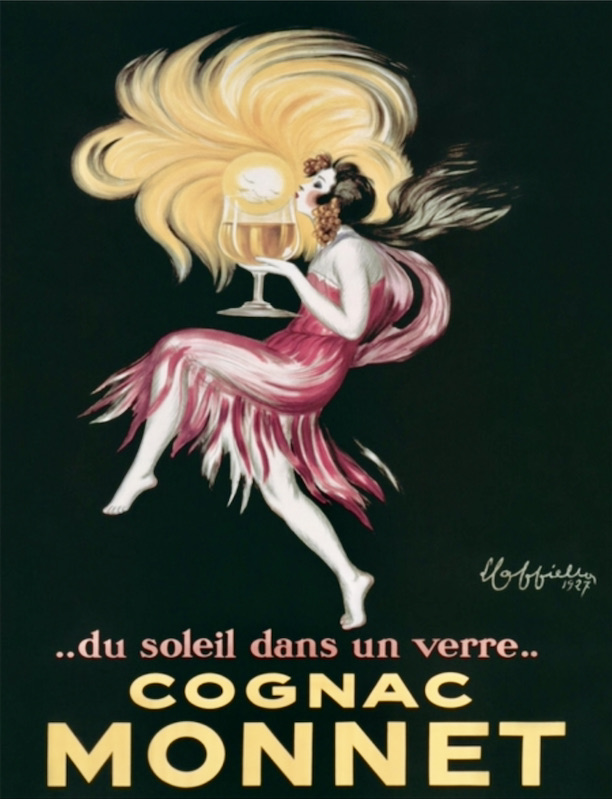
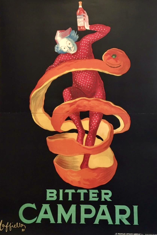
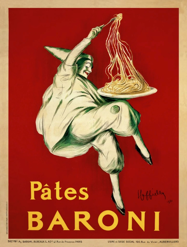
Here are three from the early 20s, two with black backgrounds, one with a deep red background:
(#2) “Sun in a glass” — for Monnet Cognac (production of which ceased in 2004); the family company of Jean Monnet, one of the founders of the European Union
(#3) Campari bittersweet apéritif (an infusion of herbs and fruit in alcohol), still available everywhere today; a crucial ingredient in the Negroni cocktail
(#4) A dancing figure, apparently out of the Italian commedia dell’arte, with a plate of one of the Baroni pastas (apparently no longer produced)
Late-breaking news. Just as I was about to post this, I discovered this 2004 book:
(#4)
[publisher’s blurb:] Leonetto Cappiello is the Father of the Modern Poster. With his penchant for contagious exuberance and intoxicating overstatement, as well as the technique of utilizing strong, flat colors against dark backgrounds, Cappiello shocked, surprised and moved the viewer; he arrested the attention of the passerby with incongruity, and as a result, effectively etched an image into their mind’s eye. He created an entirely new advertising vocabulary and his posters can be said to be fantastic – in a completely literal sense.
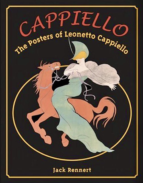
This is the largest collection of Cappiello’s work ever presented – 534 poster illustrations in full-color – as well as the most authoritative. Detailed appraisals and annotations accompany each poster, including an introduction that provides the reader with biographical information and an additional 50 color illustrations that show the many other facets of Cappiello’s talent – from book and magazine illustrations, to paintings, maquettes, postcards and, most [of] all, his superb early caricatures.
January 7, 2022 at 5:30 pm |
Thanks for this enjoyable post!
I have a personal association with the word “epiphany”, especially capitalized, though nothing to do with the Christian event and feast.
When I finally got a decent acoustic guitar, I enjoyed playing it but did not ascribe to it any personality or other kind of individuality. But reading about some performers who had named their guitars, I suddenly realized what her name, as it seemed, had to be. As I looked at her leaning against the wall, and specifically the brand name inlaid on her headstock– Epiphone– she (once named, no longer “it”) was now not just “my (anonymous) guitar”, she was obviously Lady Epiphany.
Mark Mandel 🎶
January 8, 2022 at 8:21 am |
Mark, I assume the company intended a three-syllable pronunciation of “Epiphone”, with the element “-phone” referring to sound, but of course one could read it (as you chose to do) as (Anglicized) Greek.