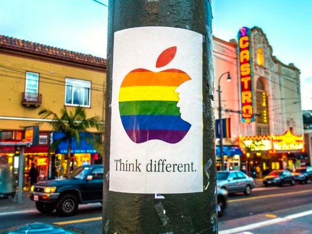
National Coming Out Day was largely a day of personal remembrance for me this year — see my posting here — so I missed a bit of significant lgbt news, with a local twist even. It came to me circuitously, via the (closed) Facebook group Our Bastard Language, in a posting by Lauren Hall, originally on October 11th (NCOD itself), where Lauren reported the Think Different poster she’d seen on Market St. in San Francisco that day. One shot among many available (this one just a bit off Market, but in a famous spot):
 (#1)
(#1)
A variant of Apple’s Think Different ad campaign of some years back, with a silhouette of Squire GrabPussy (as the President-Elect was then) instead of a semicircular bite out of the apple, and with the bands of the Pride Flag instead of Apple’s rainbow colors:
 (#2)
(#2)
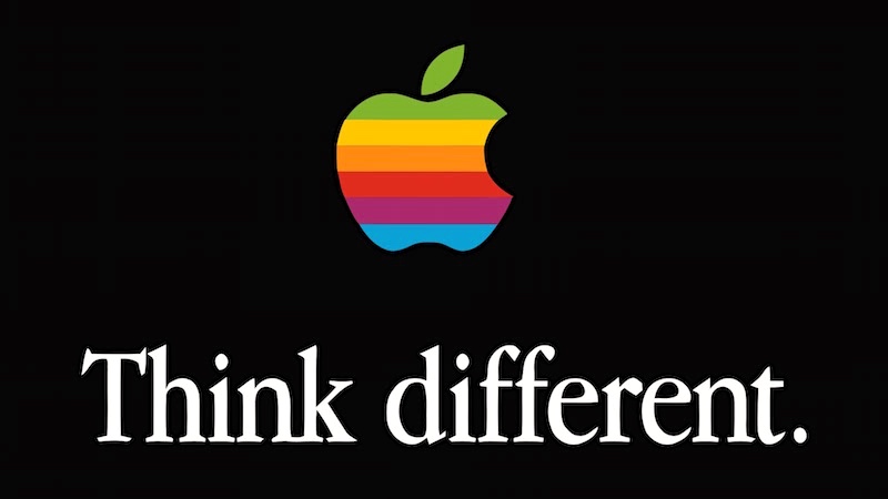
On the original, from Wikipedia:
“Think different.” was an advertising slogan for Apple, Inc. (then Apple Computer, Inc.) in 1997 created by the Los Angeles office of advertising agency TBWA\Chiat\Day. The slogan has been widely taken as a response to IBM’s slogan “Think”. It was used in a television commercial, several print advertisements, and a number of TV promos for Apple products. Apple’s use of the slogan was discontinued with the start of the iMac G4 in 2002.
(The ads achieved a certain amount of fame because of the vernaculsr bare-stem manner Adv different (rather than the suffixed Adv differently. There are people who view such things as Signs of the Apocalypse.)
But what was the NCOD poster about? From the Gateway Pundit site on October 11th, in “Trump “Think Different” Rainbow Posters Pop Up in San Francisco on National Coming Out Day” (guest post by Jay Stone):
Posters appeared across San Francisco this morning showing rainbow-colored versions of the iconic Apple logo. But instead of promoting the iPhone 7, these posters featured the silhouette of Donald J. Trump and the words “Think Different.”
The posters were most prominent in San Francisco’s Castro District. They were also photographed at Divisadero & Haight, Divisadero & Page, Market & 7th St, across from Twitter headquarters at Market & Fell, and near the HRC’s offices on Castro Street.
Last month black-and-white version of these posters appeared in Hollywood and other parts of Los Angeles.
Today is National Coming Out Day, and the artist group known only as “Art Wing Conspiracy” emphasized the importance of “culture jamming” using popular symbols and events.
… [from one of the artists] “The liberal San Francisco community needs to know that there are many Trump supporters among you. We’re here, we’re queer, and you’re just going to have to deal with it.”
Oh dear, Queers for the Orange Menace. Well, the Log Cabin Republicans appear to believe that things are going to be just splendid for LGBT rights in the new administration, despite the fact that the VP-Elect is a profoundly “Christian” man who believes that there is no such thing as LGBT rights — and cannot be, because homosexuality is a sin, a profound disorder, and a flagrant denial of his Lord Jesus Christ. Good luck in Washington, Art Wing Conspirators and Log Cabinettes.
Color time. Now for something completely different: the color bands in #1 and #2. Both are taken from a view of hues that treats them as arrayed in a spectrum around a wheel or circle. Though the spectrum is physically continuous, in this view, the RYB model with six basic hues (which is in part a culture-specific folk categorization and in part a semi-technical categorization used by many Western artists), is treated as an ordering of discrete categories: three primary (labeled in English red, yellow, blue — hence RYB) and three secondary (labeled in English purple (sometimes violet), orange, green — POG for short), with each secondary category viewed as a combination of two primary categories (P = B+R, O = R + Y, G = Y + B), and with categories directly opposite each other in the color spectrum (R and G, Y and P, B and O) said to be complementary (try not to worry about this locution). In one conventional graphic for artists, which includes the six tertiary hues:
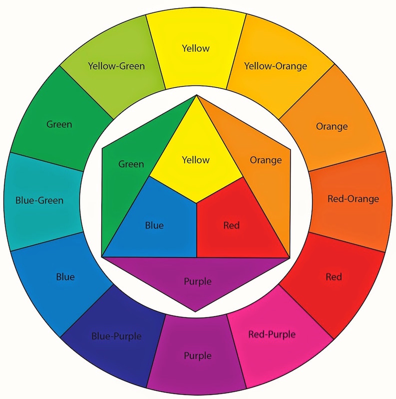 (#3)
(#3)
Y is conventionally on top, but that’s of no significance; any hue could be chosen to be on top. Physically, the spectrum of visible light goes from red (lowest frequency, longest wavelength) to purple (highest frequency, shortest wavelength) — infrared is frequencies below red, ultraviolet is frequencies above purple. The progression of hues on the color wheel conventionally goes counter-clockwise from red to purple, but again that’s of no significance; the hues could be pictured in either order.
The Pride Flag customarily has red at the top, purple at the bottom (going counter-clockwise on the color wheel). The Apple logo has (light) green at the top, (light) blue at the bottom (going clockwise on the color wheel). So they use the same materials, in a sense, but in maximally different ways.
[For reference: in addition to the RYB color model, there are also RGB and CMY (C is cyan, M magenta) color models, with complementaries R and C, G and M, and B and Y; cyan is (light) blue-green on the color wheel, magenta is (light) red-purple.]
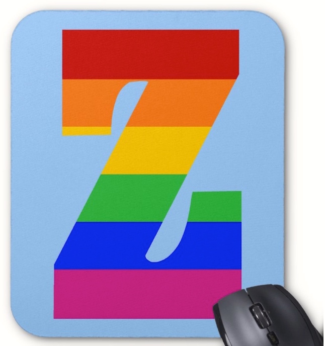
[Household note: My venerable mousepad (with a copy of my collagicization of the “On the Internet, nobody knows you’re a dog’ cartoon on it) has become irremediably grotty and its backing is flaking to death, so it was time to order a new mousepad. Good grief, the world of mousepads is mind-bloggingly huge, but many tempting choices came only through bizarre package offers, and some were absurdly expensive. I did find a nice rainbow penguin, but there seemed to be no rainbow mammoth (in a mousepad). But eventually: a rainbow Z from Zazzle (who get good reviews):
 (#4)
(#4)
Arriving in a week or so.]
November 12, 2016 at 7:31 pm |
lotta learnin in there
November 13, 2016 at 1:44 pm |
Just to add a slight complication for the sake of completeness.
Red, yellow and blue are primary colors of *pigments* such as paint.
Red, green and blue are primary colors of *light*.
In both cases, two primary colors combine to produce secondary colors depending on the proportion of each primary.
In combinations of three colors, pigments and light behave very differently.
Combining complementary pigments (three primary colors RYB) tends to produce shades of brown. Combining complementary colors of light (RGB) produces white light. ‘Black’ light is the absence of light but black and white pigments are not produced through combinations/omissions of primary colors.
White and black. Are they colors? (A semantic argument, perhaps – one I’d be interested to hear AZ’s opinion.)
November 13, 2016 at 4:52 pm |
Right you are. I deliberately shaved these complications off, thinking that the piece was awfully technical already.
The query about white and black can’t be answered unless it’s put in context.
November 14, 2016 at 4:04 am
My context is not well thought out… Paint starts as white and pigments are added to it for color. In this sense white is the absence of color. ‘Black and white’ are often contrasted with ‘color’ but I’d happily describe my car’s color as ‘white’. I guess a technical understanding suggests black and white are not colors but I imagine the general population would think that they are. Maybe I am the only one who wonders about this!
November 14, 2016 at 11:47 am |
[…] Zwicky considers the colours of the pride […]
January 17, 2021 at 2:38 pm |
[…] arrange these colors in a circle (the color wheel), rather than on a spectrum. Some discussion in my 11/12/16 posting “Something I missed on […]